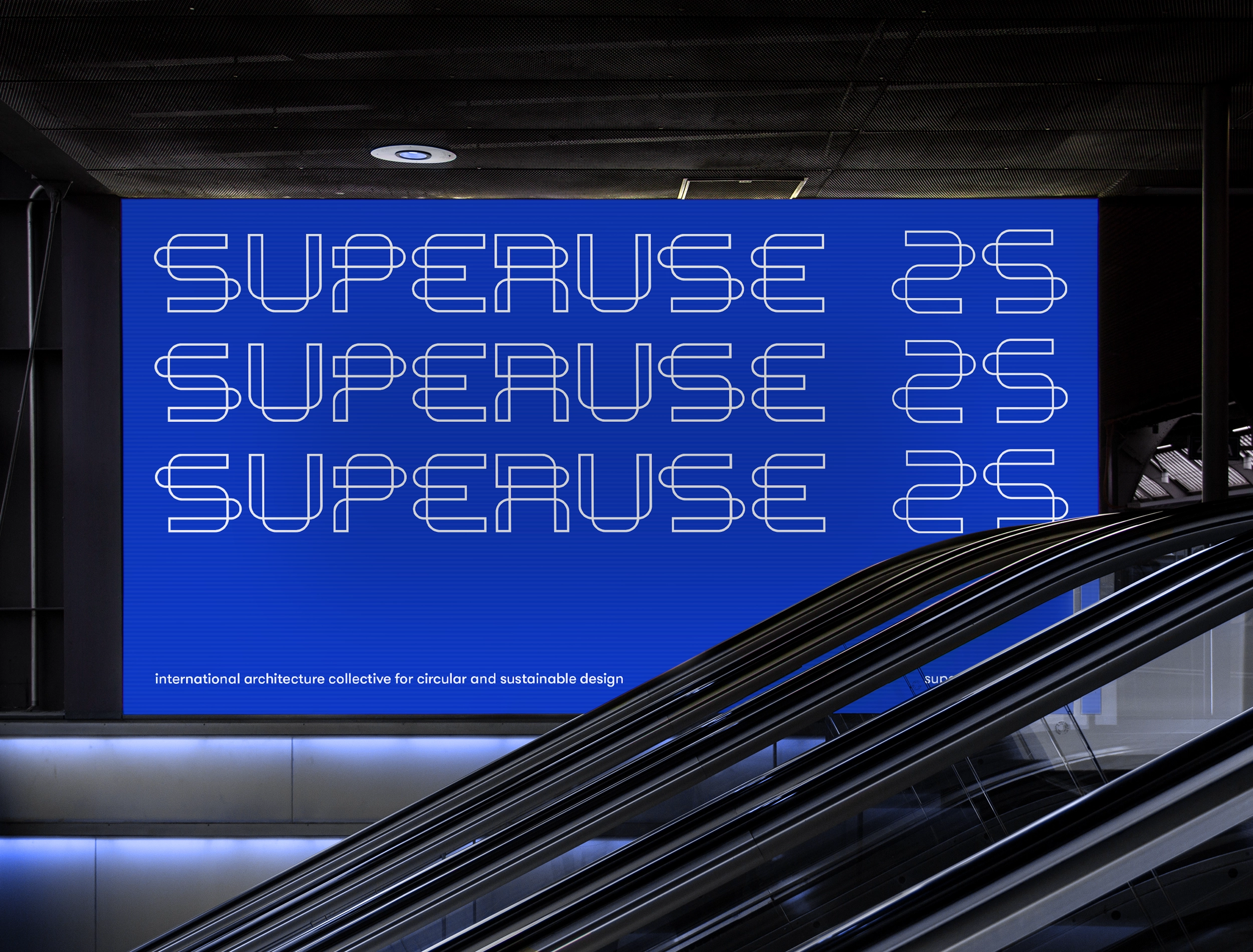
Superuse Studios

Visual identity for an international circular architecture collective

Superuse Studios is an international architecture collective which has been designing circularly for more than 25 years. The collective asked Zeppa to develop a visual identity that reflects Superuse's circular vision and makes them more visible.

Services: Branding, Visual identity, UX design, UI design, Animation, Illustration, Brochure design
Read more Read less

Superuse Studios is an international architecture collective which has been designing circularly for over 25 years. The collective asked Zeppa to develop a visual identity that reflects Superuse's circular vision and makes them more noticeable.

In addition to circular typography, we chose a friendly, rounded font, which fits well with the approachable nature of the collective. We developed a package of templates so that Superuse has all the space it needs to create its own publications.

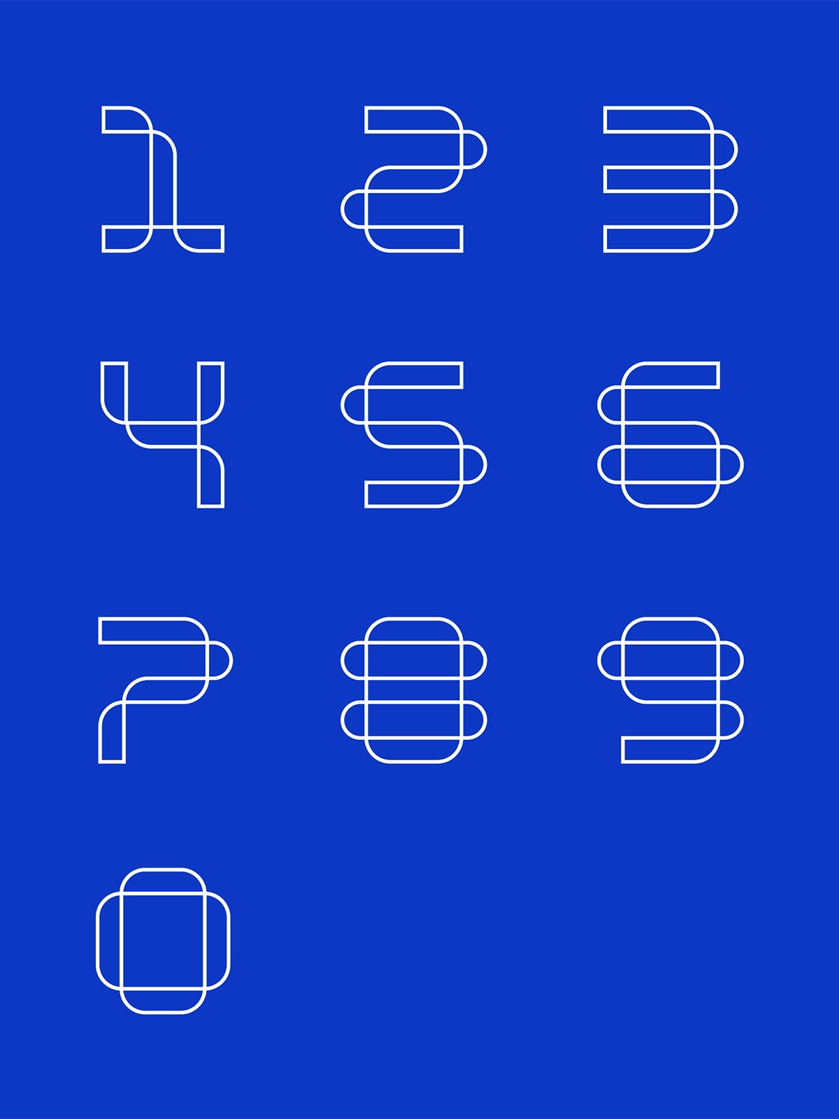
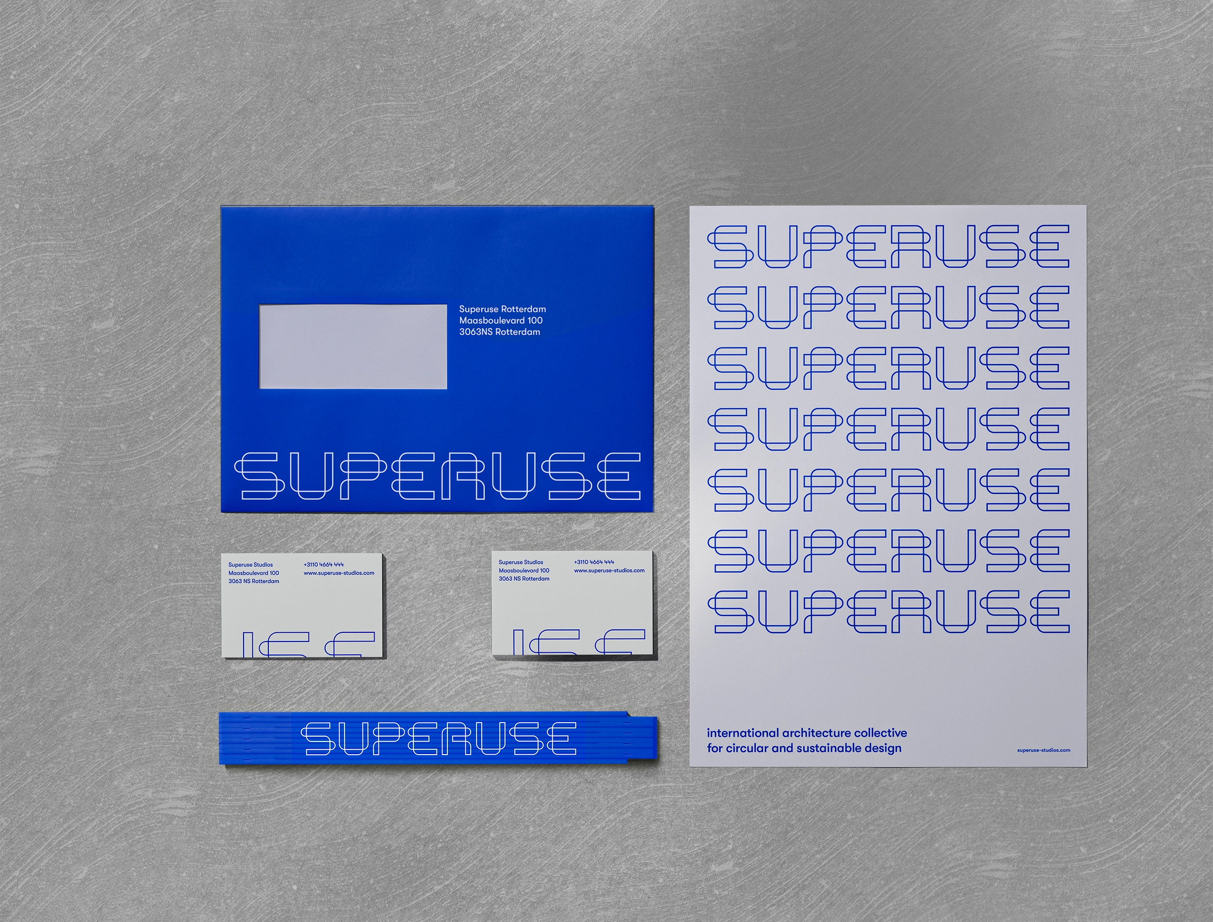
The typeface designed by Zeppa consists of closed lines that represent our circular vision. Subtle and recognizable with the vibrant blue.

- Jos de Krieger, Superuse

Resultaat

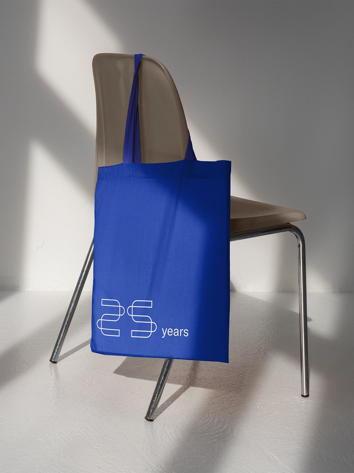
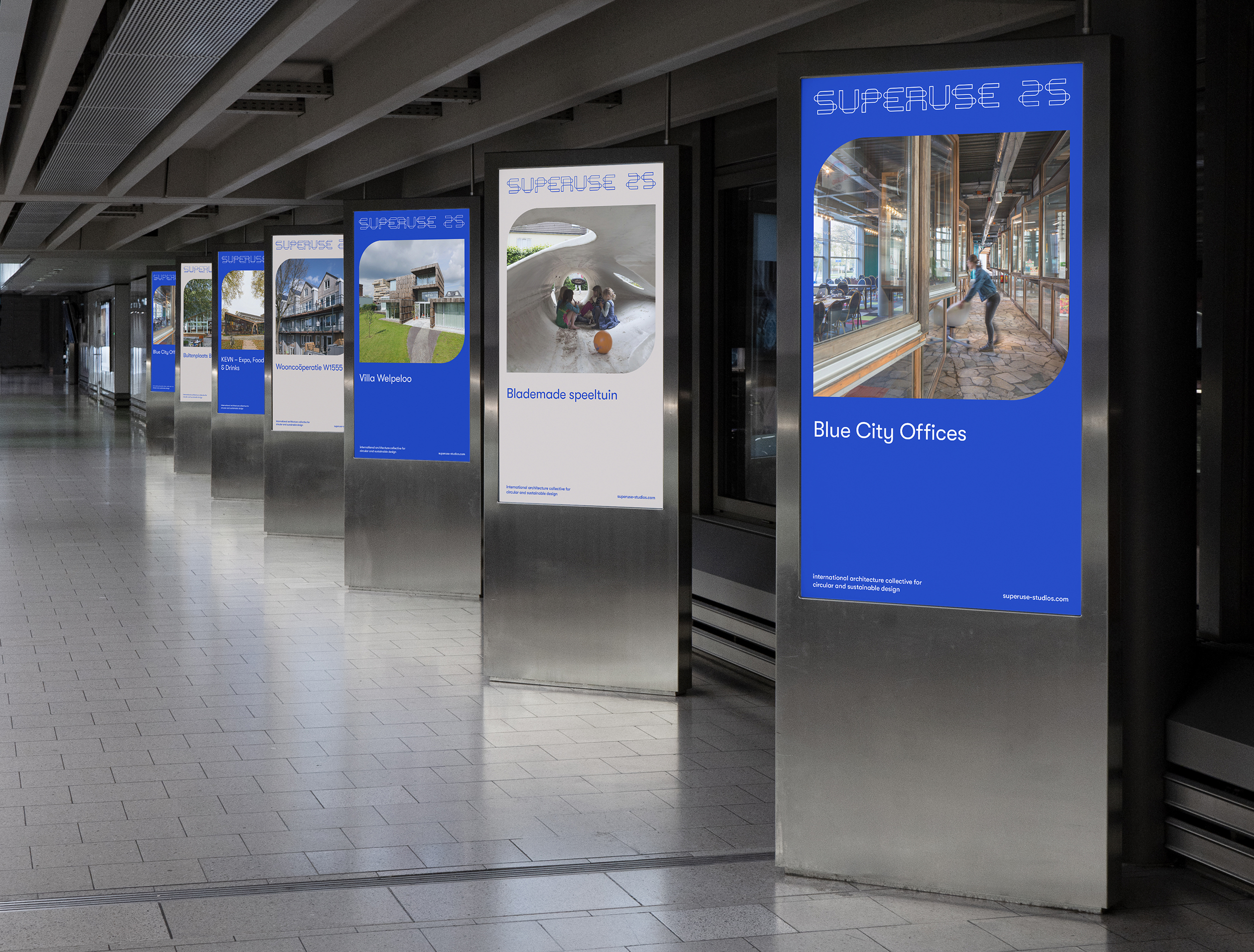
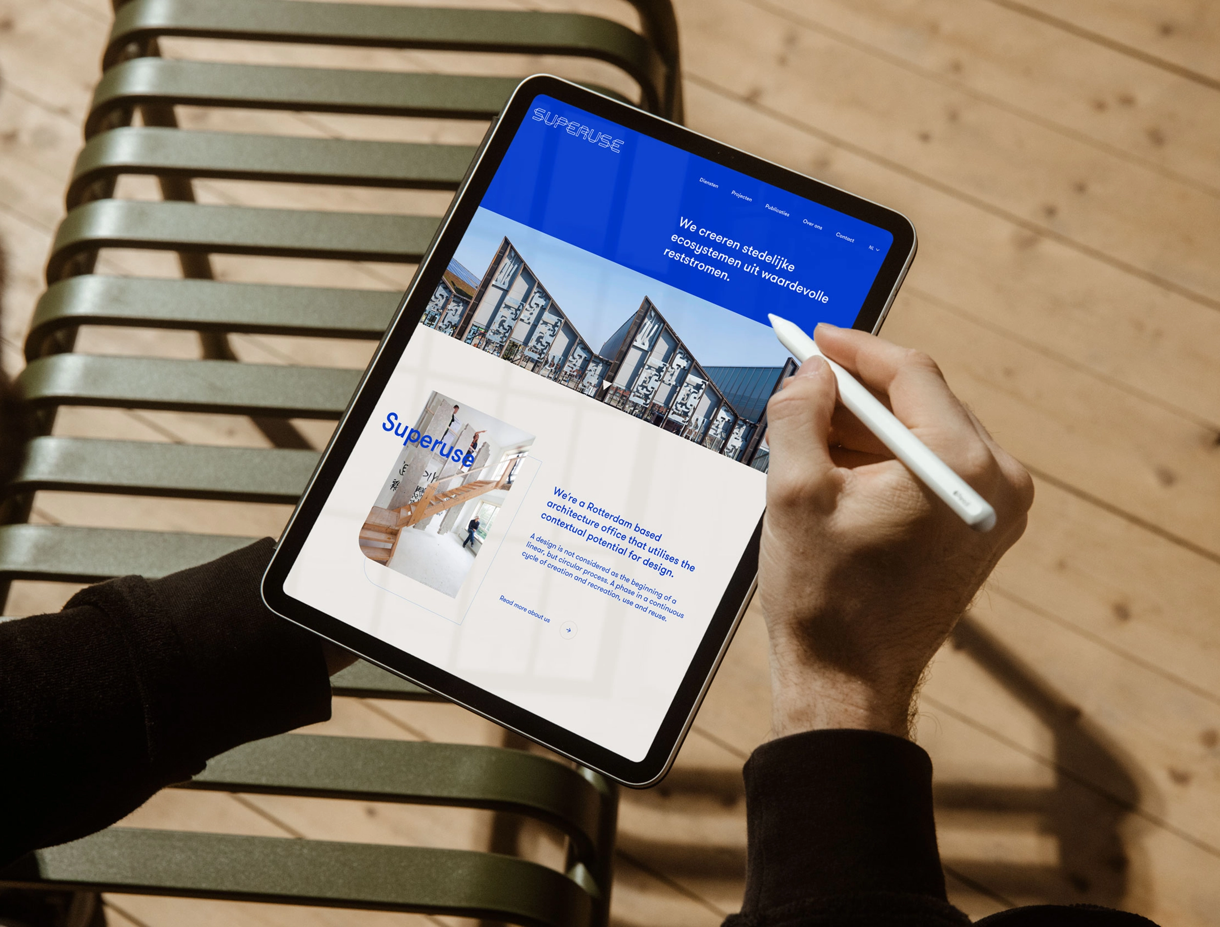
  1. A visual identity that accurately reflects Superuse's circular vision.

  2. A striking and timeless look that makes the collective stand out.

  3. A package of templates so that Superuse can produce recognisable publications independently (of Zeppa).

Client

Superuse Studios

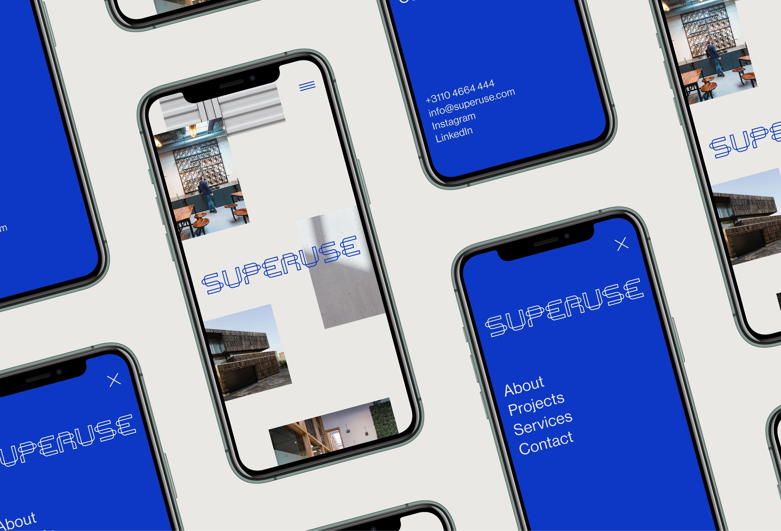
Services Branding, Visual identity, UX design, UI design, Animation, Illustration, Brochure design

Web development

Superuse Studios

Related

Do you want to stay up-to-date?

Subscribe to our newsletter.

Subscribe